Suzanne Collins
The purpose of this study is to re-design her website based on targeted user research.
The purpose of this study is to re-design her website based on targeted user research.
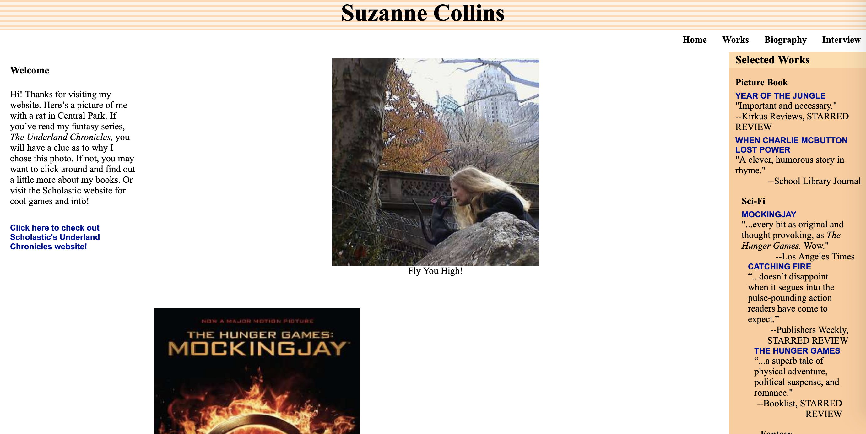
Suzanne Collins is a well-known American television writer and author of The
Hunger Games Trilogy. Her personal website is predominately used to showcase her journey as a creator.
Although the functionality of the site is there, there's some external links that don't work and some
optimizations are necessary to improve the user experience. The content itself is effective, with
coherent English grammar and relevant sections about the author’s life.
The website serves its
purpose
to provide information about Suzanne Collins and her reviews from highly acclaimed publishers. It also
follows some of the essential elements of web design such as a header, top navigation bar, and a 3
column layout. Images are provided, which is a good thing; however, some are scattered around without
proper alignment, making it look messy.
Additionally, some of the code was disorganized while
inspecting
the page source. For such a simple personal website, I'd expect the code the be cleaner and easy to
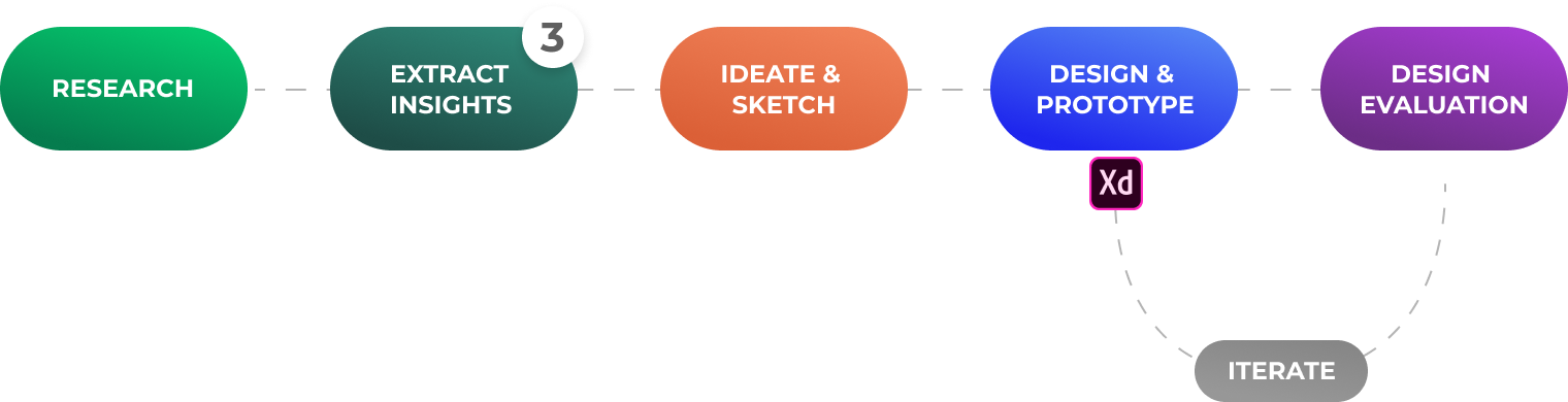
read. By effectively going through the 5 planes of the web design process, we can expect an overall
improvement in usability.
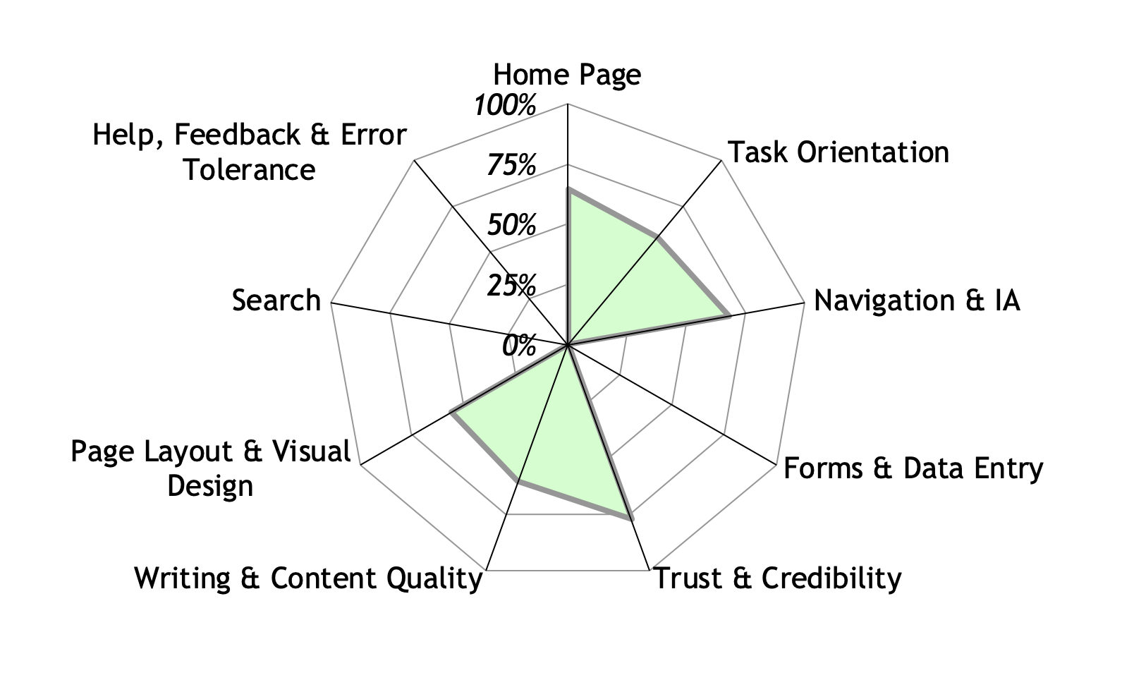
During a heuristic evaluation, usability experts review the site’s interface and
compare it against accepted usability principles. The analysis results in a list of potential usability
issues to further look into. Although it's a great methodology to obtain feedback early in the design
process, it requires knowledge and experience to apply the heuristics effectively.
The evaluation
was
broken down into the following sections: Home Page, Task Orientation, Navigation & Information
Architecture, Forms & Data Entry, Trust & Credibility, Writing & Content Quality, Page Layout & Visual
Design, Search, and Help, Feedback & Error Tolerance.
The rating system is 1 (fully compliant), 0
(partially compliant) and -1 (non-compliant). Each guideline has a rating (if applicable) and thorough
comments; supported with examples from the pages to justify the rating.
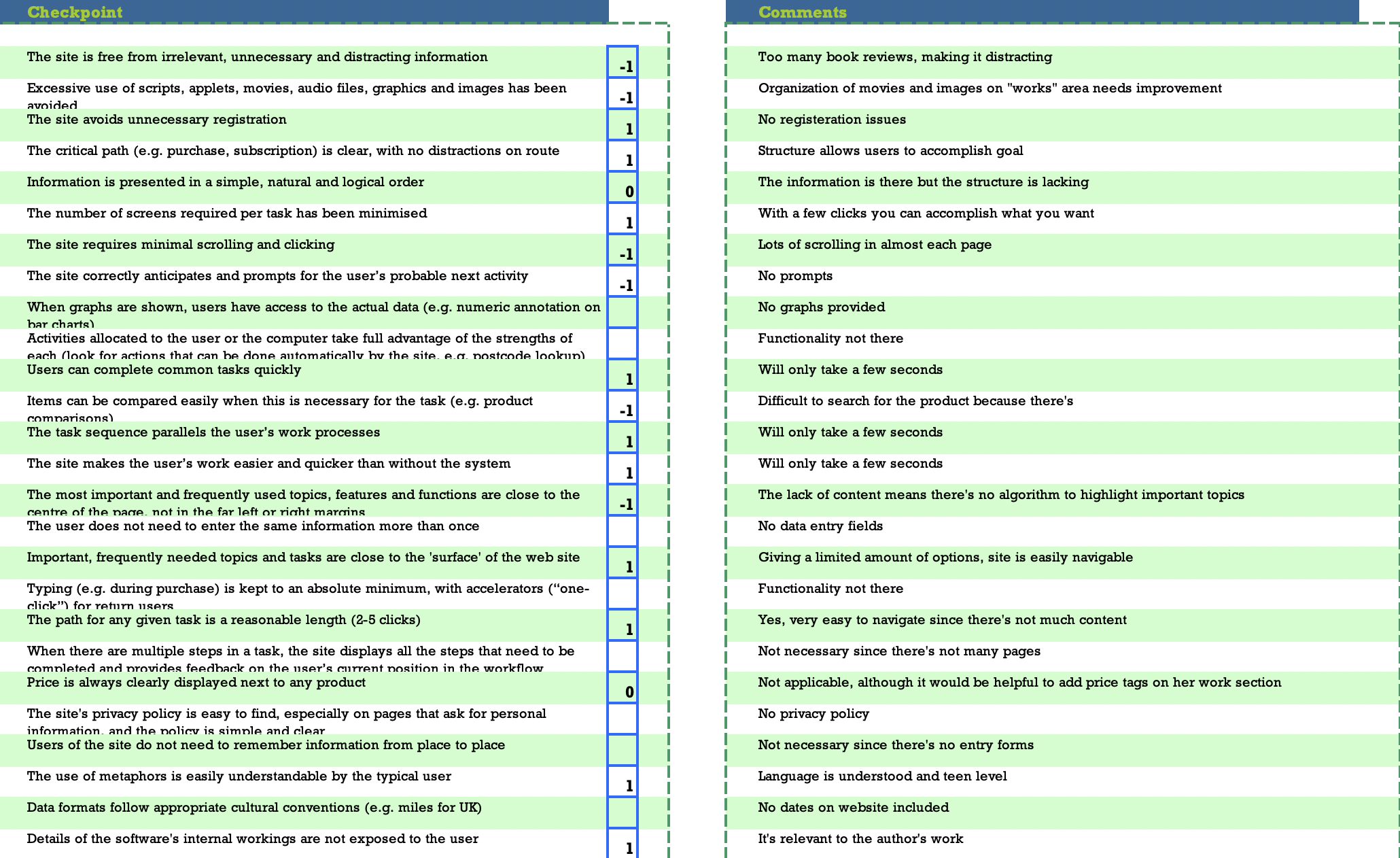
The image below shows the corresponding graphical results from each category. The summary of results indicate an overall score of 67 out of 100. Three categories were not applicable: Form & Data Entry, Search, Help, and Feedback & Error Tolerance.
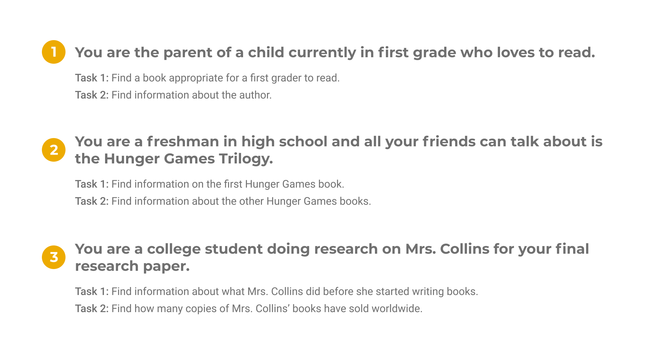
Another methodology used to determine usability is by conducting interviews. For
this instance, the usability testing materials includes a pretest questionnaire, scenarios/tasks, a
post-test questionnaire, and an observation sheet. The prior heuristic evaluation was used to develop
corresponding scenarios based on qualifying, prioritized issues.
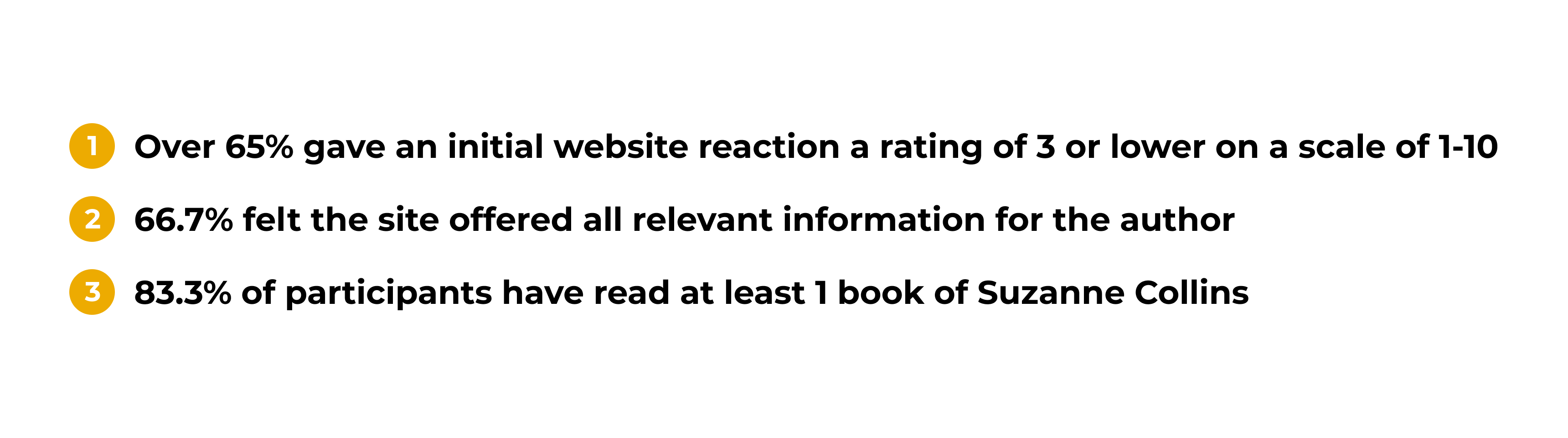
Pretest Questionnaire: Five questions are demographic-type questions and questions to help assess
the
experience level of the participant as it relates to the website.
Scenarios/Tasks: The test includes three scenarios, and each scenario includes two tasks. The
tasks
relate to usability issues that exist within the website, and the scenarios are appropriate with the
tasks.
Post-Test Questionnaire: The post-test questionnaire includes five questions. These questions ask
the
participant about their opinion of the website as it relates to their experience in completing the
tasks.
Observation Sheet: The observation sheet contains individual tasks with the most likely path the
participants will take. Space is leftover for any comments or questions that the participant asks to
record.
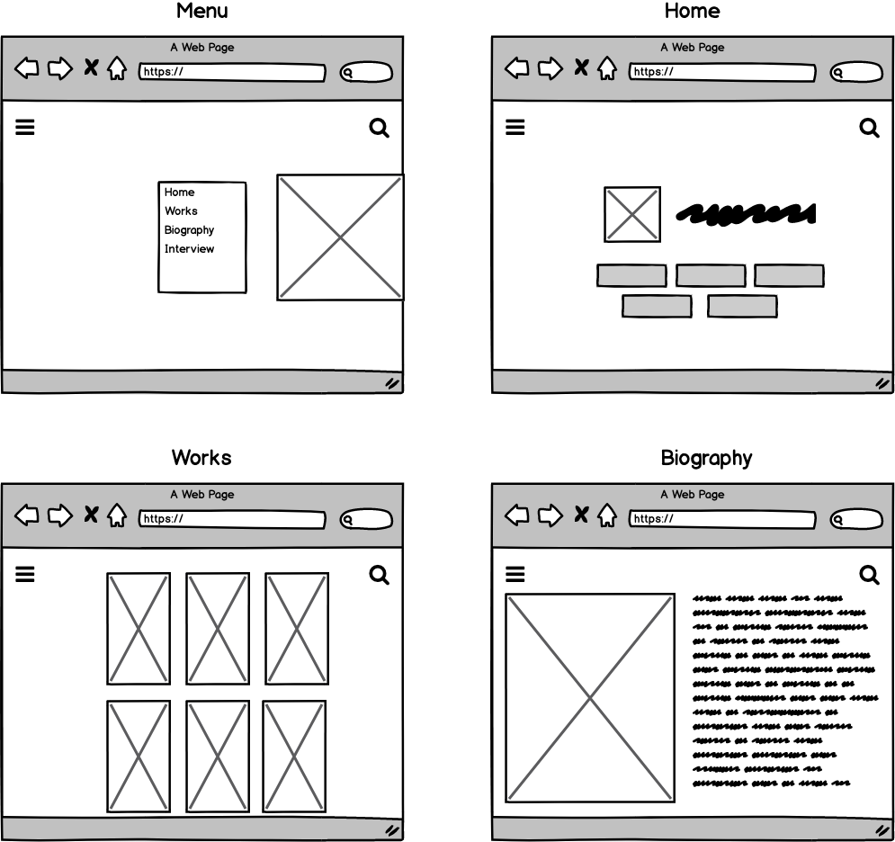
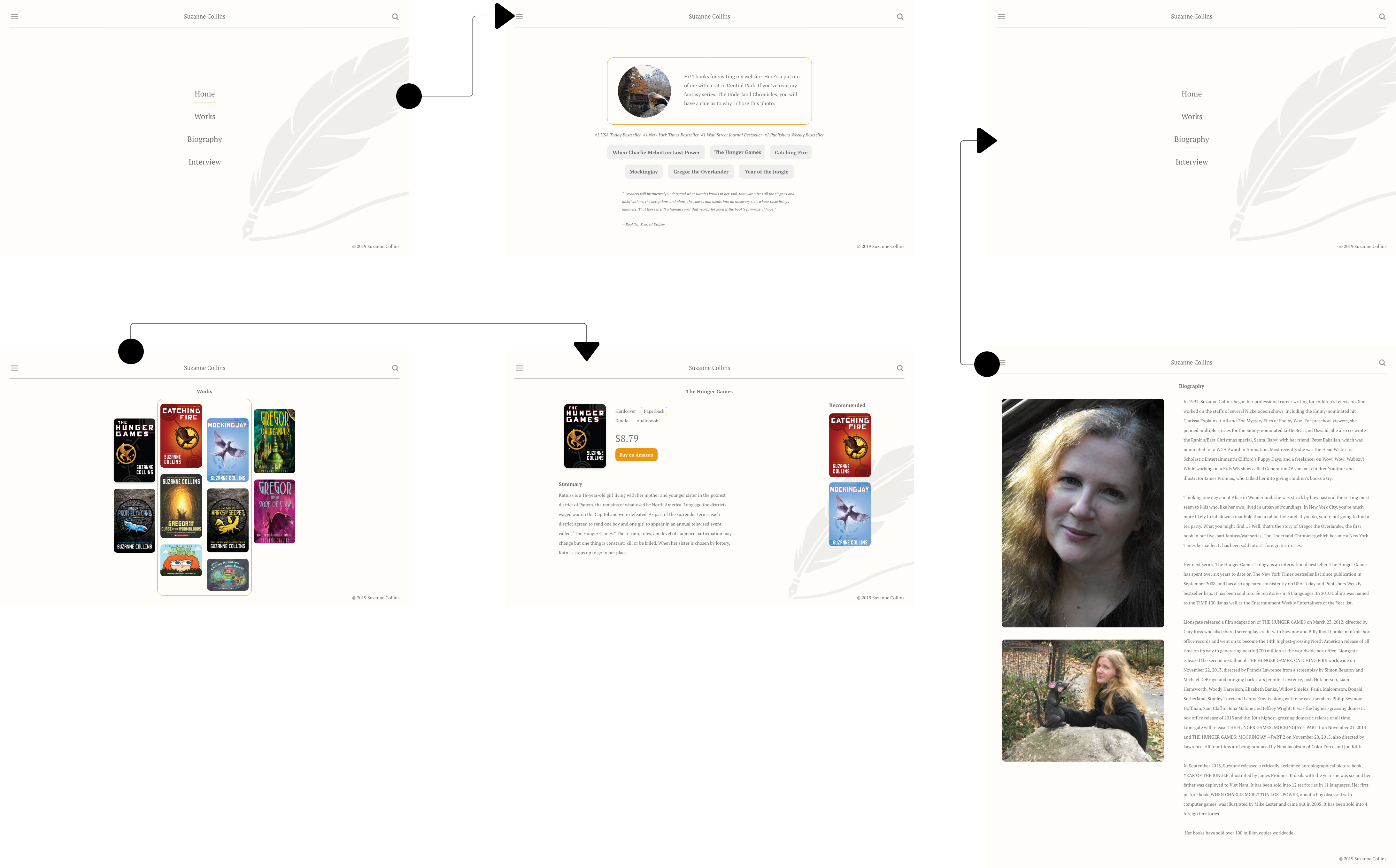
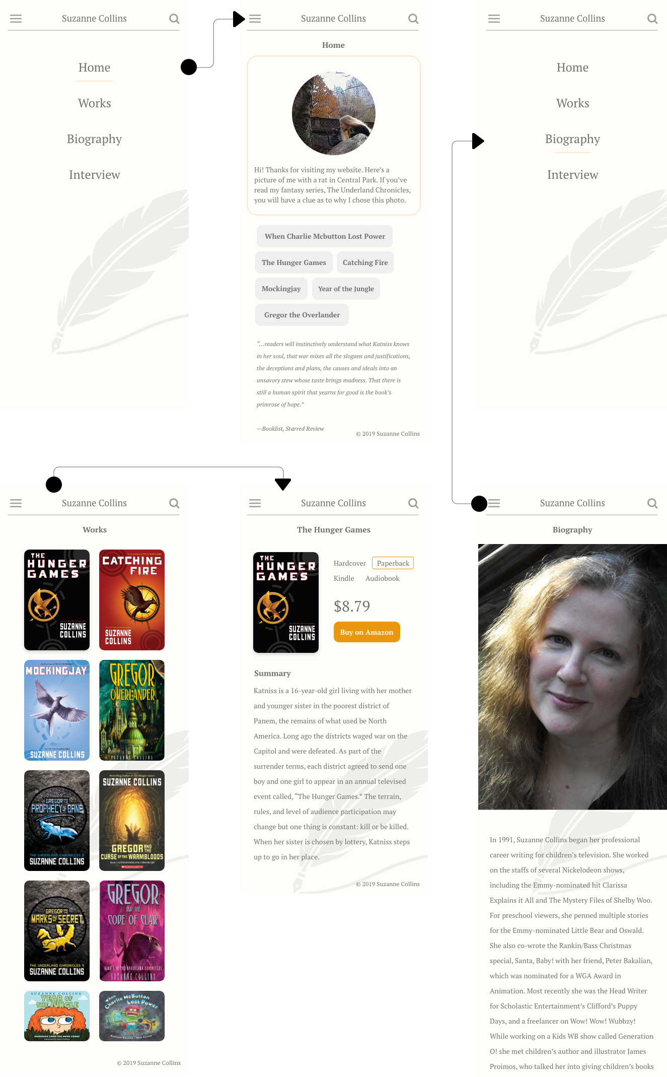
Home
Redesigning the home layout was crucial since it’s sometimes the first screen a user sees. The previous
design was disorganized and caused users to wonder the purpose of the site because it contained
navigation links and multiple external links that lead elsewhere. Not only would decreasing the number
of external links on the homepage increase retention, but it also needed to focus more on Suzanne
Collins and her work. The page got revamped into a more minimal, eye-catching format, with few
distractions.
The color palette for the redesign remained similar, capturing a slight background
tint of
orange, dark gray text, and complementary borders with tangerine color. The focus point is directed
towards the welcome textbox, represented inside a curved rectangle box. During the analysis of the
usability test, various participants mentioned “colors” as one of their three critical items needed for
improvement. With 50% of participants rating the navigation usability less than a four on a scale of
1-10, our solution was to dedicate a screen solely to navigation. The menu icon located on the upper
left hand would serve this purpose.
Works
Repetition, a principle of design, is a great way to unify a model that brings together a lot of
different elements. Repetition can be done in several ways: via repeating the same colors, typefaces,
and shapes. For the works screen, we included the same top navigation from the home screen and legal
footer note. We also incorporated a simple pattern to provide a list of all her books with one glance.
The previous design required users to scroll continuously over a handful of highly-acclaimed
published
reviews. Removing all of the distractions as before, we were left with a scrolls view containing all of
her published books. On hover, a tangerine-colored border will appear inside the element to indicate its
current state. If selected, it’ll take the user to the product screen view to obtain further
details.
A
recommendation during usability testing was to “create an on-site purchasing platform” because there are
links within the current site that lead to Amazon’s homepage instead of direct links to her work.
To solve this issue, we placed book options and a button “buy on Amazon” to facilitate purchases.
Creating an on-site purchasing platform was significant since optimizing the click path can lead to an
increase in sales.
Biography
The biography section had the least amount of issues, with all being minor improvements. The main
difference done was to match the top navigation and footer note to the updated design, including the
font family. PT Serif, the selected font, has a more significant number of weights and forms and
looks
pleasantly professional. We also enlarged the images of Suzanne Collins and moved one of her interview
pictures to this section, as well.